A website that sounds like Jon: Lichfield Drive & Patio Cleaning
How we rebuilt a family run jet wash business website around its owner: an illustrated Jon in every section, all 199 Google reviews on show, a quote form people finish, and 26 town pages built for local search.
- Google reviews shown
- All 199, at 5.0
- Town pages
- 26
- Lighthouse SEO
- 100
- Client
- Jet wash business, Lichfield
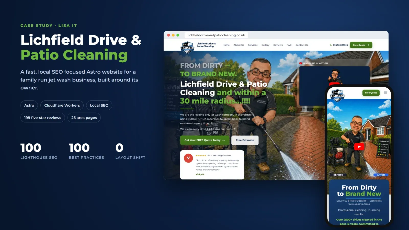
Jon runs Lichfield Drive & Patio Cleaning. In over ten years of jet washing driveways and patios around Lichfield, he has cleaned more than 2,500 drives, earned a perfect 5.0 rating across 199 Google reviews, and won the Best of Lichfield Gold Standard Award two years running.
His old WordPress site showed none of that. It was slow, it looked like every other trade site, and it hid the most persuasive thing the business has, which is Jon. Customers do not hire a jet wash company. They hire Jon, and their reviews say so again and again: “Lovely fella”, “a great bloke”, “treated my house like it was his own”.
You can see the finished site at lichfielddriveandpatiocleaning.co.uk.
The brief
We set ourselves four goals:
- Put Jon front and centre. The site should feel like meeting Jon in person.
- Prove it straight away. Real before and after photos, real reviews and real awards, all on screen or one scroll away.
- Make getting a quote effortless, on a phone, in under a minute.
- Win local search across the 30 mile radius the business actually covers, without losing any of the Google traffic the old site had.
Trying three designs before choosing one
Before building the real thing, we made three working versions of the top of the home page, so Jon could try each one on his own phone instead of judging pictures:
- Version A: dark navy and lime, with the quote form right at the top. Bold, but it felt like a sales page.
- Version B: light and airy, with white cards floating over a full width illustration. Friendly and trustworthy.
- Version C: dark and “premium”, with glass effects and electric blue. Striking, but too corporate for a local tradesman.
Version B won, because it matched how customers describe Jon: approachable, clean, no nonsense. Every section of the finished site grew out of it.
Why working pages instead of mockups? Small business owners judge a website on their phone, in their hand, in a few seconds. Letting Jon use each version for real got a clear answer in one conversation instead of three rounds of feedback.
Jon is the mascot
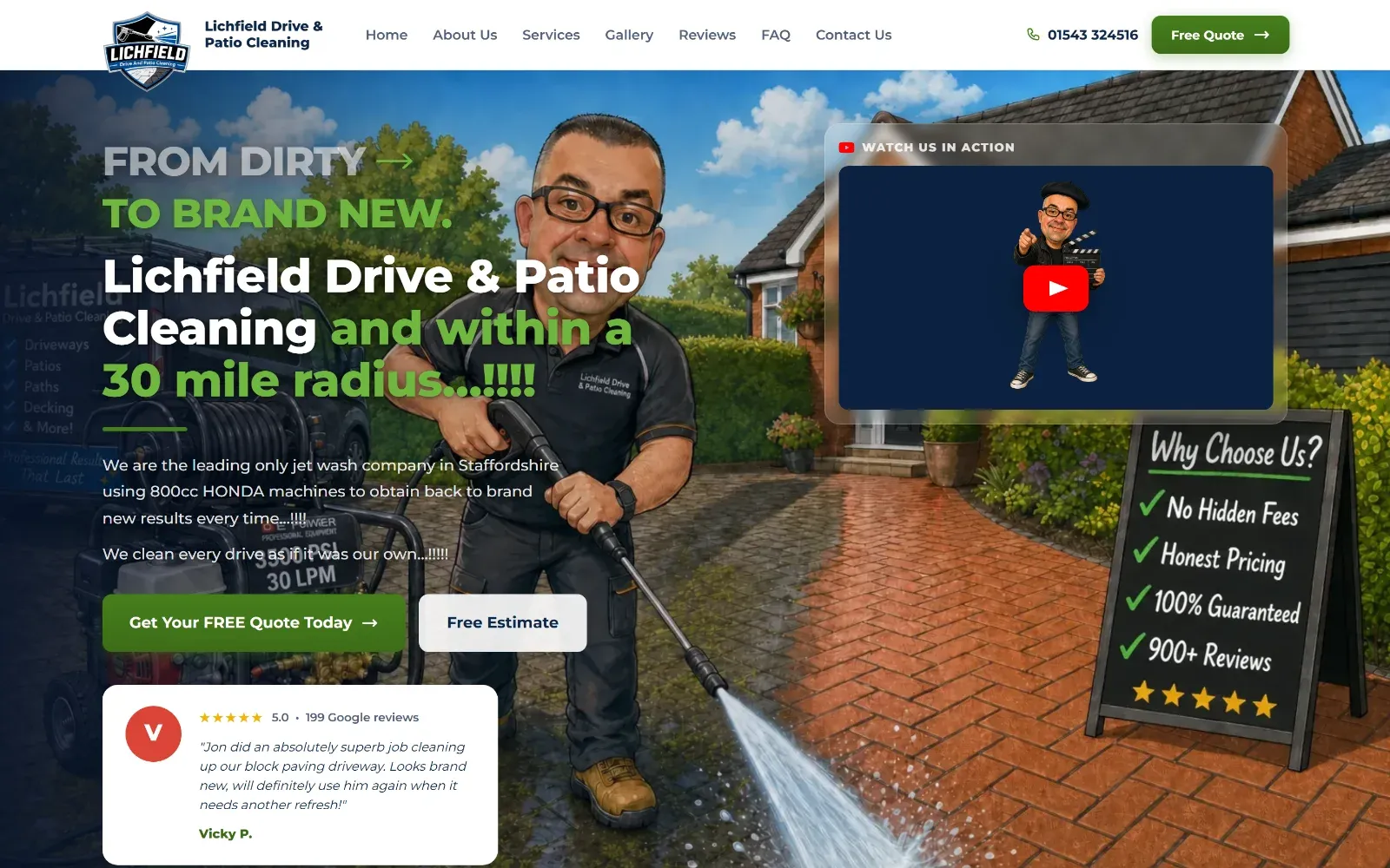
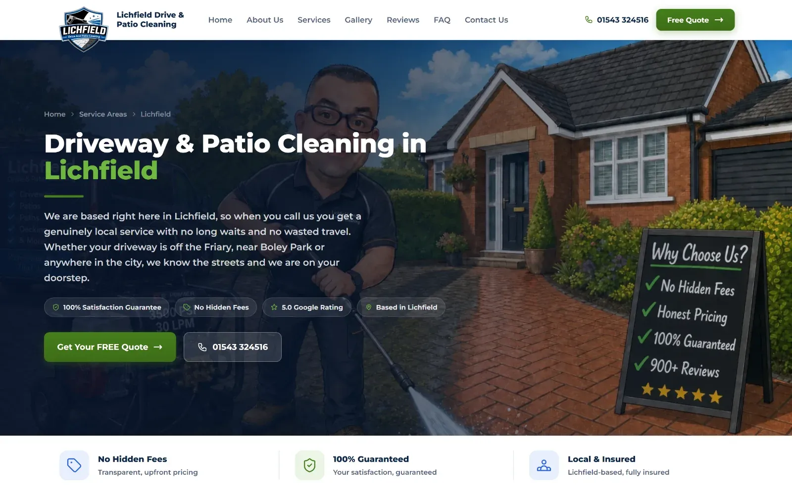
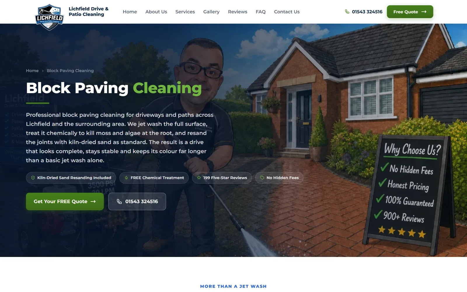
We turned a photo of Jon into a hand drawn style caricature of him pressure washing a block paved drive, with a clear split between dirty on the left and clean on the right. That one picture does three jobs:
- It is the before and after. The whole service is explained before anyone reads a word.
- It is memorable. Nobody else in the area looks like this. People remember “the one with the cartoon bloke”.
- It is honest. It is recognisably Jon, so the person who turns up at the door is the person on the website.
Then we gave every section its own Jon, doing something that fits:
| Section | Jon is… |
|---|---|
| Top of the page | Pressure washing a driveway, dirty to clean |
| Services | Mid spray with the lance |
| Areas covered | Giving a thumbs up next to his branded van |
| Reviews | Holding a wooden “5.0” star sign |
| Awards | Holding a gold trophy |
| Questions | Holding a clipboard, finger raised |
Each one is cut out and colour matched to the navy panels, so it sits naturally in the page rather than looking pasted on.
A proper phone layout, not a squashed desktop
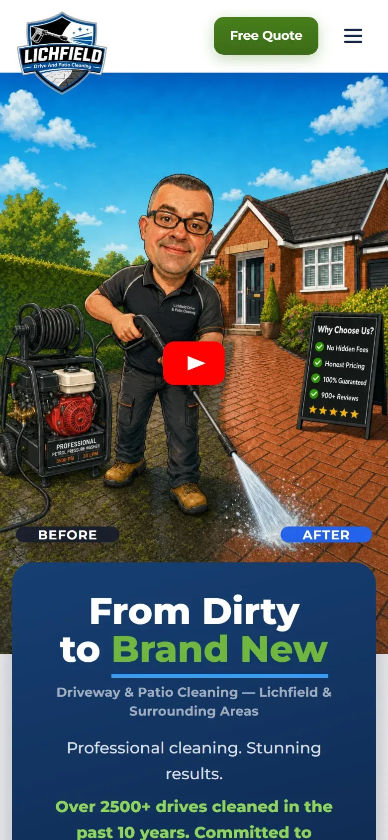
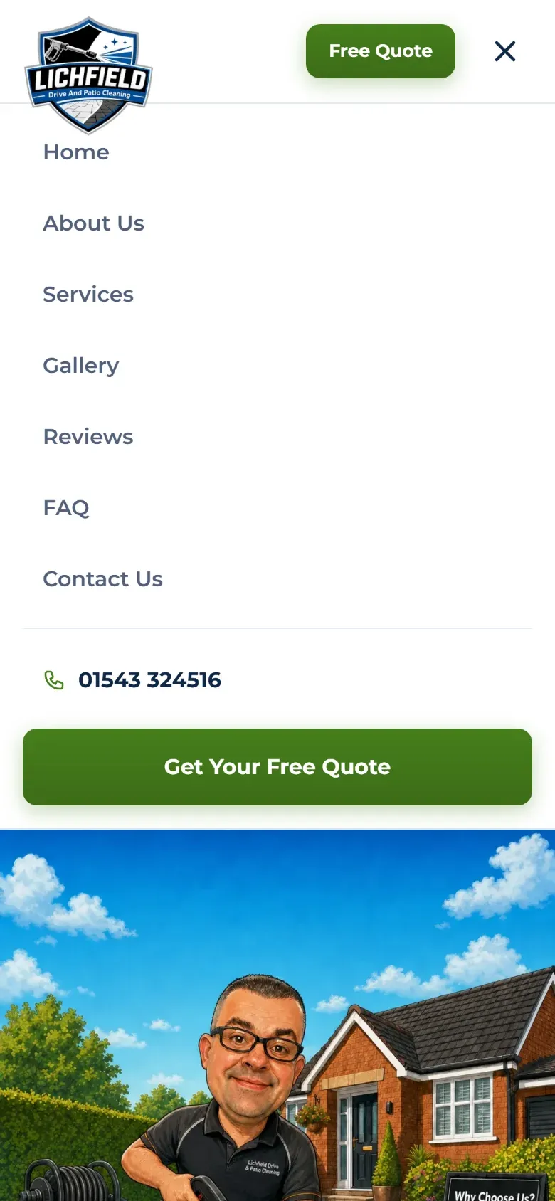
Most of Jon’s visitors arrive on a phone, often standing on the very driveway they want cleaned. So instead of letting the desktop design collapse into a stack, we designed the phone version as its own layout:
- A portrait version of the illustration, with clear BEFORE and AFTER labels.
- A bold navy headline card, “From Dirty to Brand New”, overlapping the picture.
- A green Free Quote button always in the header, so it is never more than a thumb away.
- The menu ends with the phone number and a full width quote button, so browsing always leads somewhere.
The menu and the quote popup are built with CSS alone, with no JavaScript to download, so they open instantly even on a weak signal.
Proof, then more proof
Real before and after photos
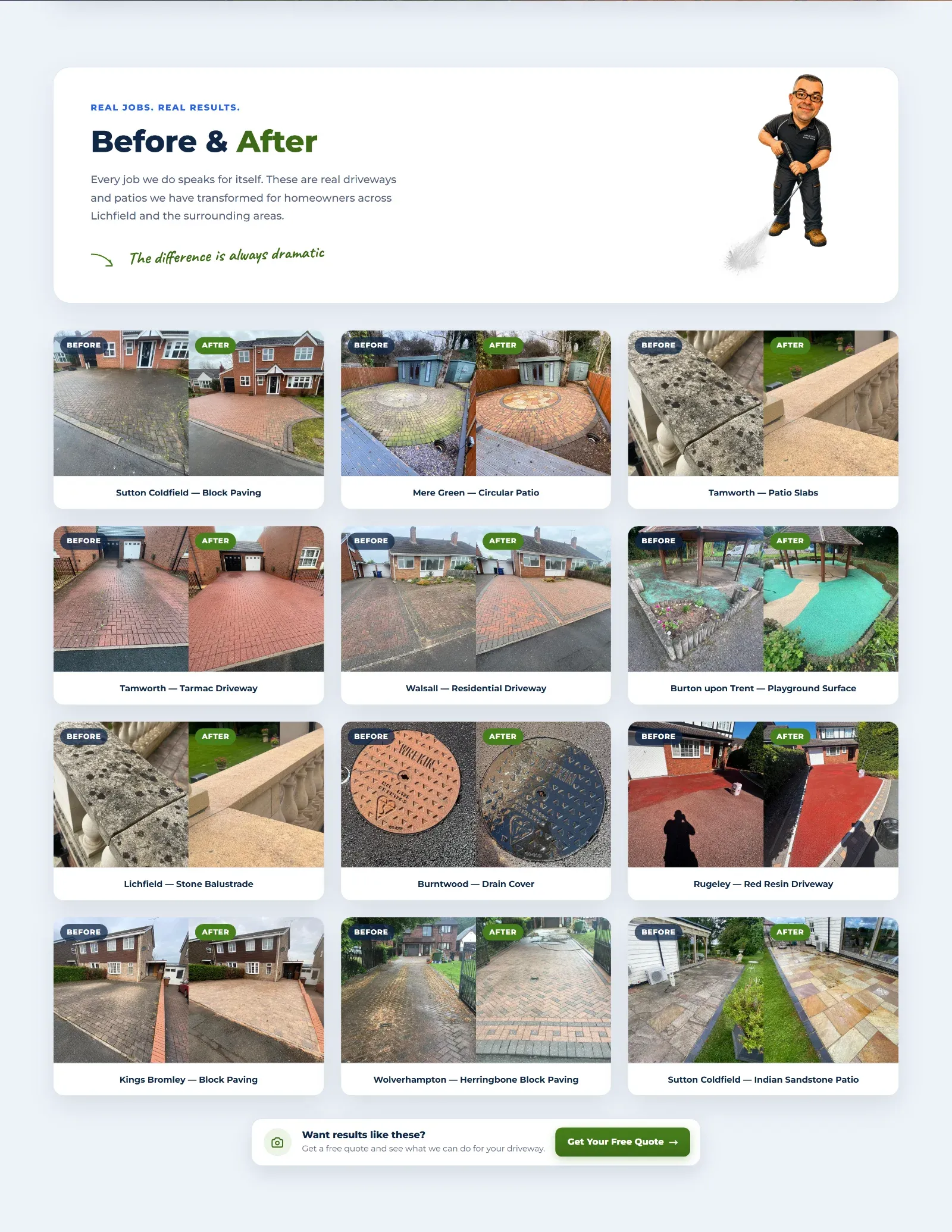
Twelve real jobs, each labelled with the town and the surface: “Tamworth: Tarmac Driveway”, “Sutton Coldfield: Indian Sandstone Patio”. Someone from Tamworth sees work done down their road, and the surface labels answer “can you do my kind of drive?” before they have to ask. Each pair opens up for a closer look.
Every review, not just the best three
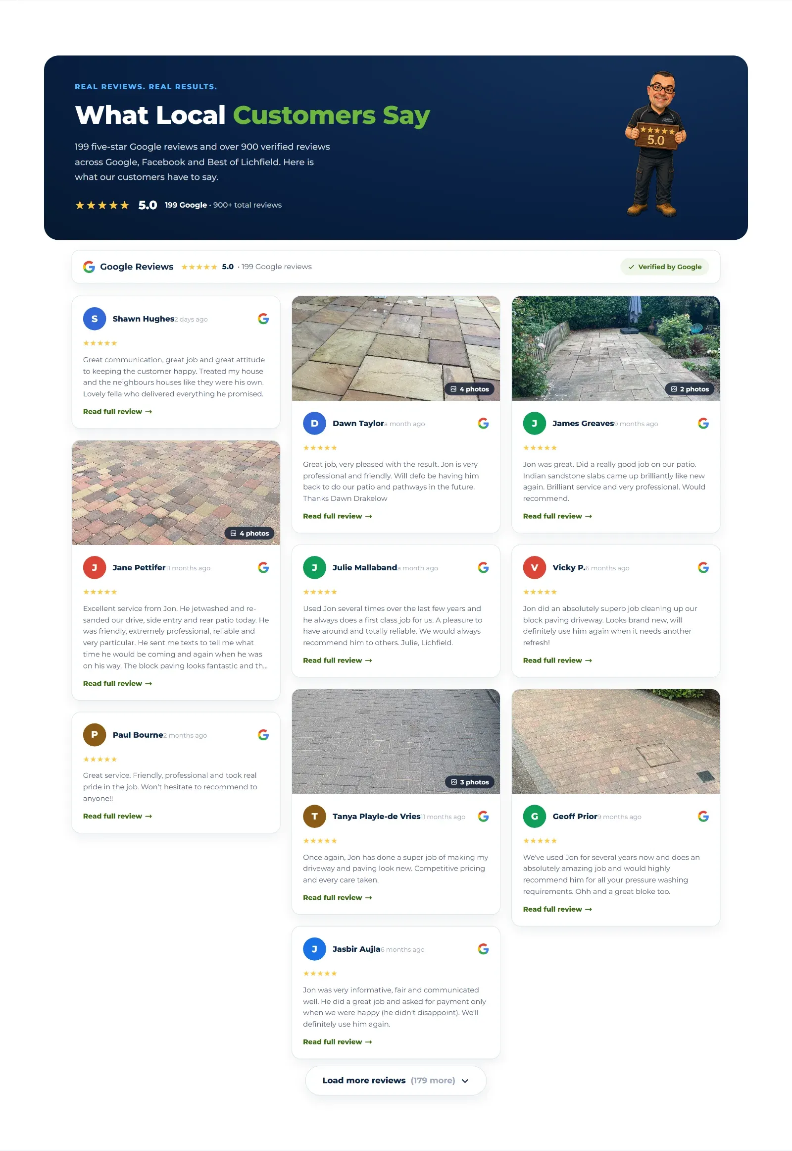
Most sites show three hand picked testimonials, and visitors know it. We brought all 199 Google reviews and 66 customer photos into the site. A chosen few show first, then visitors can keep loading ten at a time until they have read every single one. Tapping a review opens it in full, with all its photos.
Showing everything is a confident move, and it only works because the reviews really are that good. That is exactly the point the site needed to make.
Awards and independent reviews
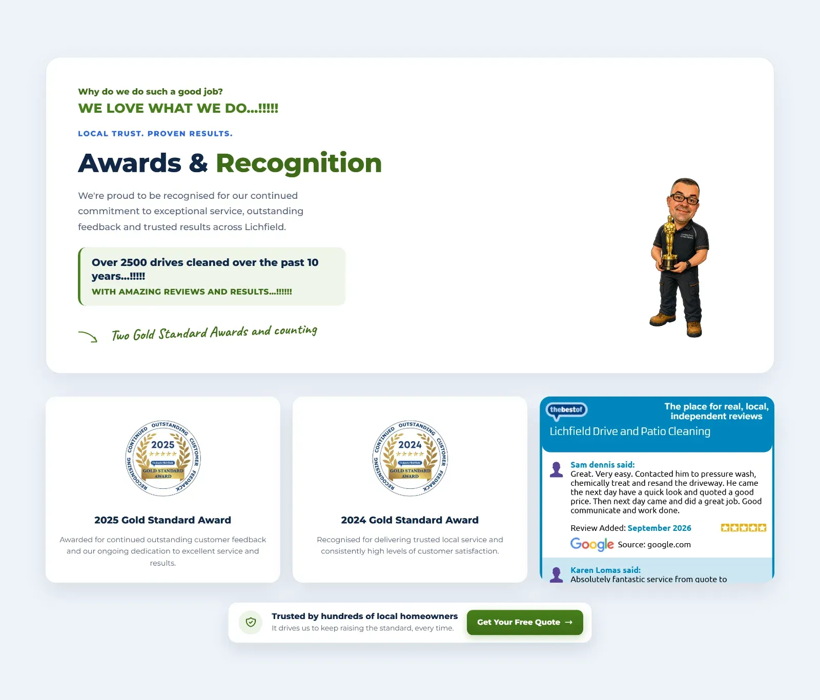
The two Gold Standard Awards sit next to a live feed from Best of Lichfield, an independent local review site. That is proof from someone else, not just the business talking about itself.
A quote form people actually finish
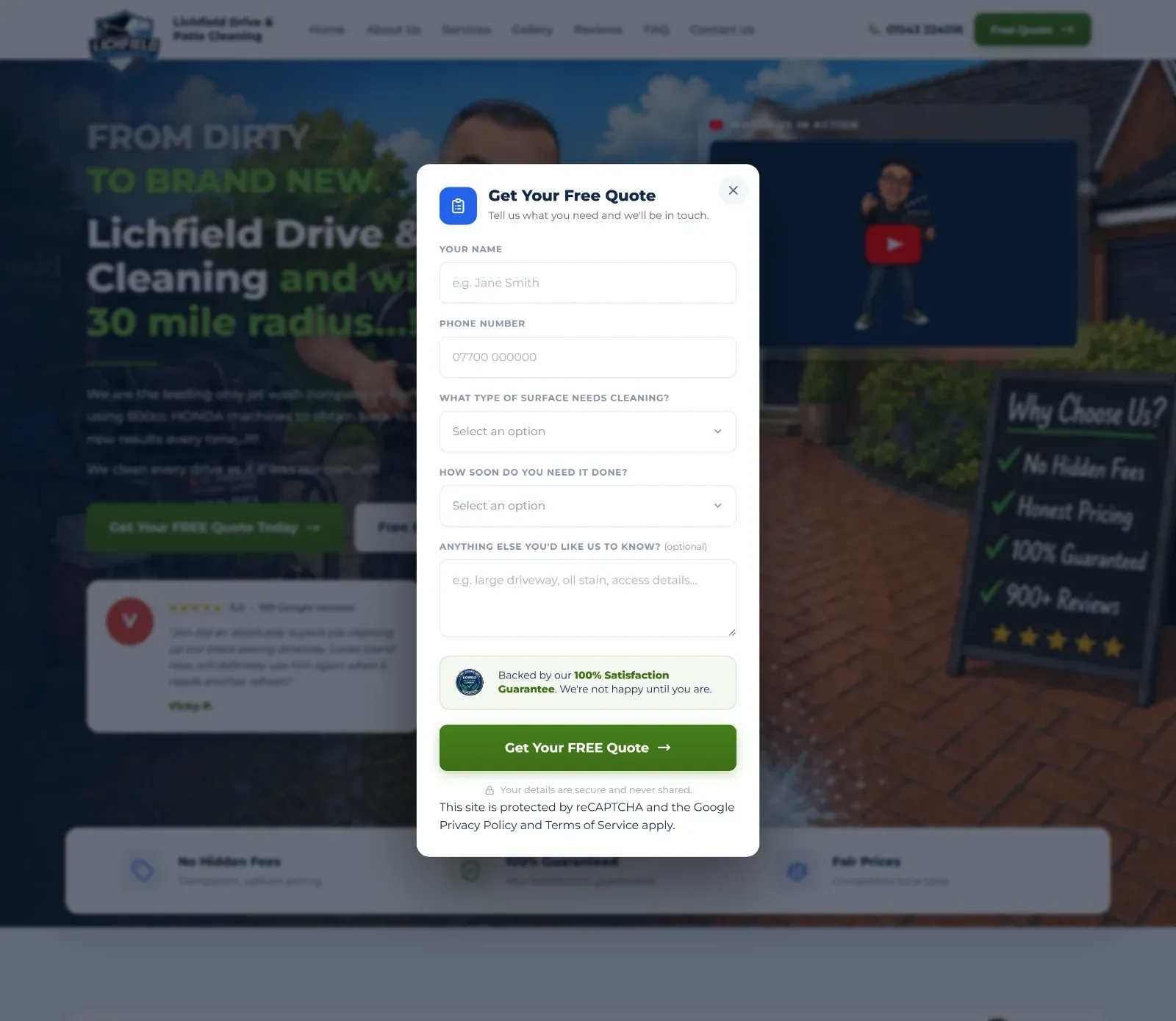
Every “Get Your Free Quote” button on the site opens the same short popup. We cut it down to only what Jon needs to call someone back:
- Name
- Phone number
- What type of surface?
- How soon?
- Anything else? (optional)
No email address, no postcode lookup, no account. The two dropdowns tell Jon what the job is and how urgent it is before he picks up the phone.
Right above the send button sits the 100% Satisfaction Guarantee seal. The moment someone hesitates is exactly where the reassurance appears.
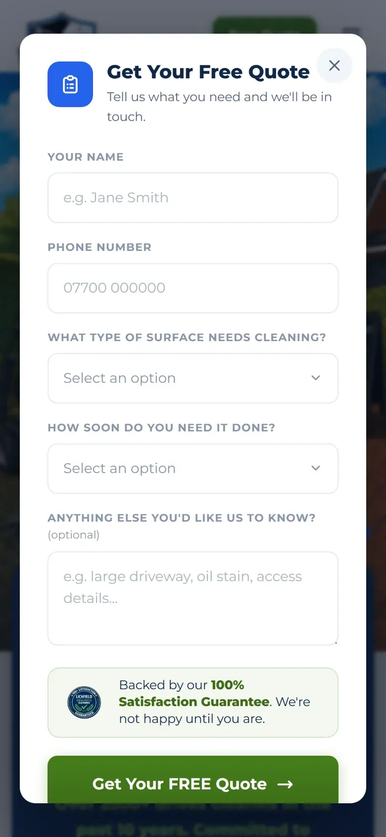
Behind the scenes, three layers of invisible spam protection keep the junk out, so real customers never have to solve a puzzle. Every enquiry goes straight to Jon’s email.
Colours everyone can read
The brand is navy and green: navy for trust, green for “clean” and for every button we want people to press.
The first green we tried was the bright, grassy shade from the logo. It looked great, but white text on it was too hard to read, scoring 3.18 to 1 on the accessibility contrast test where 4.5 to 1 is the minimum. Rather than lose it, we split the green into jobs:
| Colour | Contrast on white | Used for |
|---|---|---|
Green #467f1c | 4.87 to 1 (passes) | Buttons, links, green text |
Dark green #3d6c17 | 6.26 to 1 (passes) | Button shading, emphasis |
Bright green #6fb63f | Dark backgrounds only | Headline highlights on navy |
Navy #102747 | Headings, dark panels |
So the bright green still makes the headlines pop on the navy panels (“Brand New”, “What Local Customers Say”), and every button stays readable for everyone.
One pattern, repeated down the page
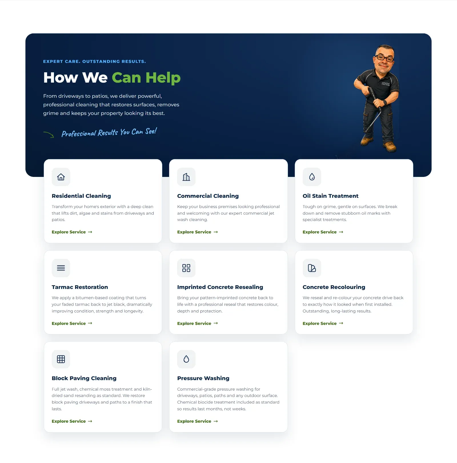
Every section on the home page follows the same pattern:
- A rounded intro panel, alternating navy and white down the page.
- A short line of capitals above the heading, such as “EXPERT CARE. OUTSTANDING RESULTS.”
- A two tone headline with the key word in green.
- A handwritten note with a little arrow, like “Professional Results You Can See!”. That is Jon’s voice, as if he scribbled it on the page.
- A Jon that fits the section.
- Cards that overlap the panel, then a small “next step” bar with one button.
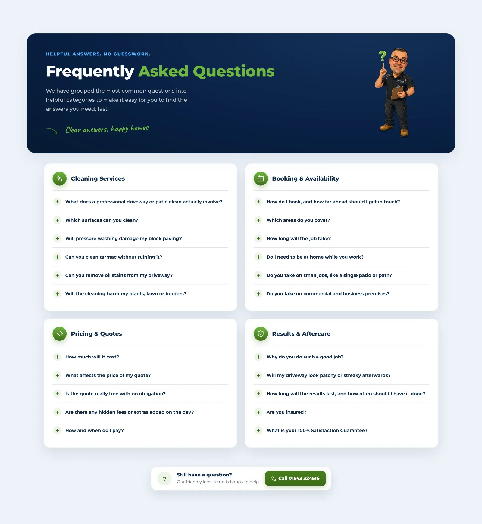
Because the pattern repeats, the page feels designed rather than thrown together, and visitors quickly learn how to read it. The fonts are kept simple too: Montserrat for everything, with the handwritten Caveat used sparingly for Jon’s notes.
Built for local search
Jon covers a 30 mile radius, and people search by town: “driveway cleaning Tamworth”, “pressure washing Sutton Coldfield”. So we built the site around exactly that.
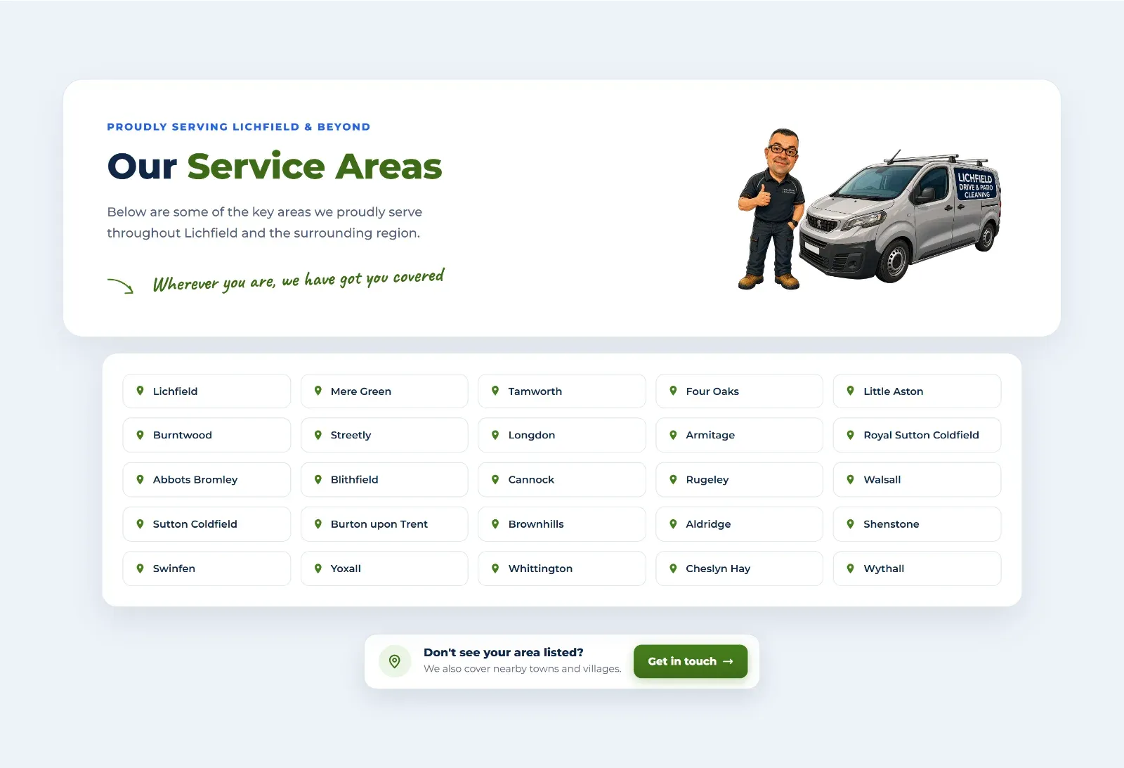
- We kept every page Google was already sending visitors to. Before building anything we pulled the old site’s Google Search Console data and planned the new site around the pages that earned clicks, so the relaunch did not throw away years of rankings
- 26 town pages. Lichfield, Tamworth, Burntwood, Walsall, Wythall and more each get their own page, with local wording, nearby areas, the before and after gallery, reviews and questions. Adding a new town takes one line
- Pages named the way people search. Search Console showed the site appearing 2,360 times for “pressure washing near me”, while the old pages only said “jet wash”. That became its own Pressure Washing page. Block paving cleaning got the same treatment
- Structured data on every page, so Google knows exactly what Jon does, where he works and what his customers say
- Ready for AI search. A plain summary file tells assistants like ChatGPT and Perplexity about the business, its services and the areas it covers
Fast, secure and nothing to maintain
The site is built with Astro, which turns every page into plain, lightweight HTML. It is hosted on Cloudflare, so pages are served from a data centre close to each visitor. There are no plugins to update and nothing for hackers to poke at, and every change Jon asks for goes live as soon as we publish it.
A few of the details that keep it quick:
- Images are compressed and only load as you scroll to them
- The main picture starts downloading straight away
- The fonts never hold up the page
- Space is saved for every image, so nothing jumps around while the page loads
Google Lighthouse scores (desktop, live site):
| Performance | Accessibility | Best practices | SEO |
|---|---|---|---|
| 89 | 96 | 100 | 100 |
The result
Jon now has a website that feels like Jon: friendly, proud of the work, and completely open about what his customers think. Visitors see the transformation, the proof and the free, no obligation quote within seconds, and they can ask for a quote from any section of any page in a couple of taps.
Under the bonnet it is fast, secure, cheap to run, easy to add to, and set up to win the town by town searches that local customers actually make.
Is your business better than your website?
Plenty of great local businesses have a website that undersells them. If yours does, we would love to help you tell your story. Send us a message on WhatsApp or get in touch.